
By Phillip Tanzilo, CPTD, MHRM
Why visual design should support engagement, not compete with it.
Introduction: The Problem Isn’t PowerPoint
Most learning challenges are not caused by the tool itself but by how the tool is used.
We’ve most likely heard the phrase “death by PowerPoint.” I have learned to understand why.
Several years ago, I worked with a client whose slides contained nearly every word they planned to say. Part of that was driven by legal requirements because participants needed a detailed reference document after the session. The challenge was that those slides were being used as both a presentation and a takeaway resource. Over time, I’ve learned those are two very different purposes.
When learners try to read dense slides while simultaneously listening to a facilitator, attention becomes divided. The audience begins choosing whether to read or listen because doing both well becomes difficult.
The issue wasn’t PowerPoint. The issue was how the tool was being used.
Visual Design Enhances Learning and Memory: Clarity Helps the Brain Focus
I’ve learned that when visuals are simple and intentional, people spend less time interpreting information and more time engaging with ideas.
I invite people to reframe how they think about visual learning tools. PowerPoint, Prezi, whiteboards, videos, infographics, and digital collaboration platforms can all enhance learning when used intentionally.
Over the years, I have learned that visuals work best when they create clarity rather than complexity. Good visuals help learners organize information, identify patterns, and focus on the most important concepts.
The goal is not to create impressive slides. The goal is to help learners understand, retain, and apply information more effectively. When visuals are designed with purpose, they become powerful tools that support learning rather than compete with it.
Poor Design Creates Cognitive Overload: Too Much Information Competes for Attention
When everything is competing for attention, very little actually sticks.
One of the most common mistakes I continue to see is the belief that more information creates more learning. The opposite is often true.
I’ve watched learners disengage when slides try to do too much. Reading, listening, interpreting charts, and following a presenter all at the same time can become exhausting.
Slides overloaded with text, excessive animations, dense charts, and competing visual elements divide attention rather than support comprehension. Good design creates focus. Poor design creates fatigue.
The brain can only process so much information at once. When every element on a slide is demanding attention, learners often remember less rather than more.
Engagement Matters More Than the Tool: Learning Happens When People Participate
I’ve learned that people rarely remember what they simply see—they remember what they discuss, practice, and experience.
I invite facilitators, trainers, and leaders to consistently remain open and rethink all learning tools. Adults learn best when they can connect ideas to real experiences, contribute to discussions, reflect on meaning, and apply concepts to practical situations.
Knowles’ Adult Learning Theory reminds us that adults want relevance, participation, and opportunities to connect learning to their own experiences. True engagement occurs when learners can see ideas, discuss them, practice them, and apply them.
The tool is simply the vehicle. Engagement is the destination.
Building Learning Experiences That Light Up Learning: Design for Participation, Not Presentation
The most effective learning experiences balance visual support with active participation.
I have experienced that the best learning environments use visuals as one component of a broader experience.
- Questions create reflection.
- Activities create application.
- Discussion creates meaning.
- Stories create emotional connection.
- Visuals create focus.
When these elements work together, learning becomes more memorable because participants are actively involved rather than passively observing. That is when learning truly begins to stick.
Final Thoughts: Light Up Learning, Don’t Overload It
Visual learning tools create the greatest impact when they support engagement rather than replace it.
Over the years, I’ve come to believe that PowerPoint was never the villain. Like any tool, its impact depends on how we use it. The real challenge is ensuring that visuals support engagement rather than replace it, because learning happens through participation, not presentation.
I invite you to reframe the conversation. “Death by PowerPoint” doesn’t mean abandoning visual tools.
It means using them intentionally. When we light up learning instead of overloading learners, visuals become powerful catalysts for engagement rather than barriers to it.
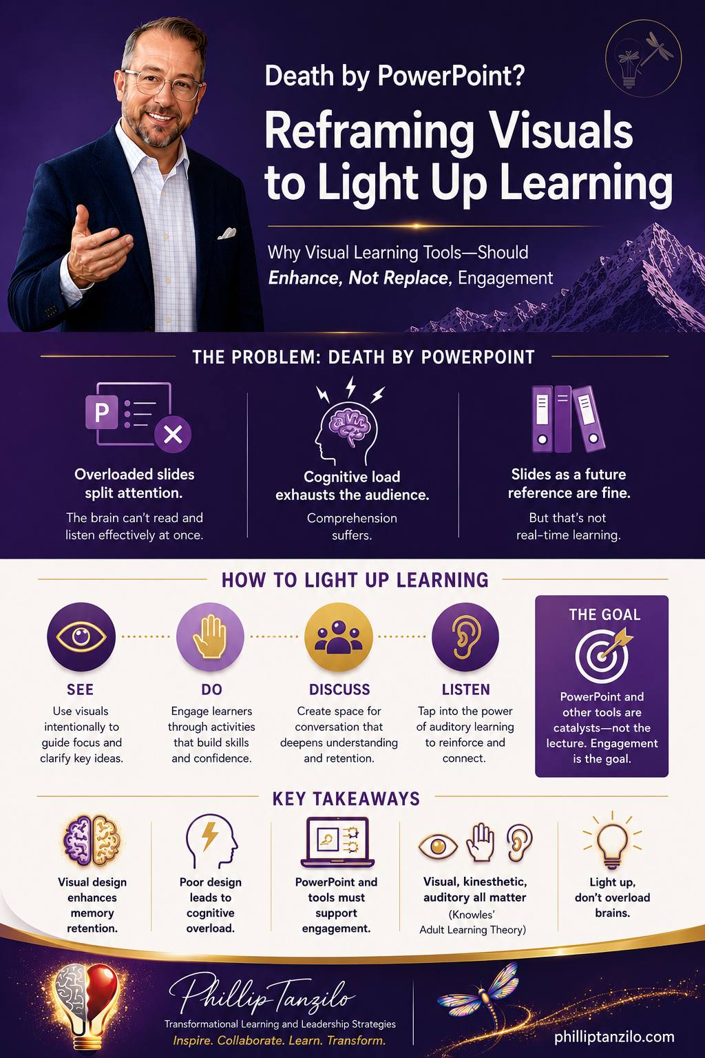
Key Takeaways:
• Visual design enhances memory retention
• Poor design leads to cognitive overload
• PowerPoint and tools must support engagement
• Visual, kinesthetic, auditory all matter (Knowles’ Theory)
• Light up, don’t overload brains
#DeathByPowerPoint #PowerPoint #VisualDesign #AdultLearning #InstructionalDesign #LearningEngagement #KinestheticLearning #Prezi #FacilitationTools #CorporateTraining #ActiveLearning #CognitiveScience #LeadershipDevelopment #AdultLearningTheory